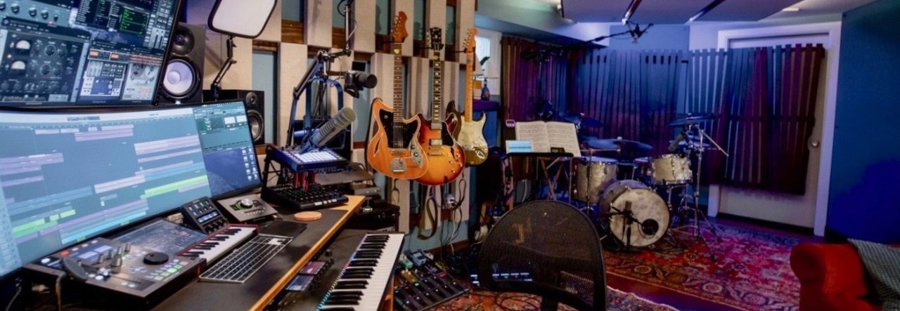
At the start of 2009 I finished work on my first solo album, titled “The Exited Door.” It is a collection of thirteen original songs, and it features just about every Bay Area musician I know. It has been, to embrace the cliche, a labor of love – I began work on the record at the start of 2008, and spent most of the year shepherding the disc from conception to completion. I am immensely pleased with the finished product.
This is the seventh and final part in a seven-part blog series detailing the various phases of its creation. Part one covers the initial conception, part two is on the writing and scoring of the music. Part three details the creation of the album demos, and part four is about the large recording sessions we did throughout the summer. Part five covers the final recording sessions and the initial mixing process, and part six details the final mixing and mastering processes.
The record is now available at CDBaby.com, as well as for download from iTunes and Digstation. Tracks from the disc are streaming on my myspace page.
Part Seven: Artwork, Photos, and Design

Assembling the artwork and finalizing the design on the album was by far the easiest part of production. With the tunes written, recorded, edited, and mastered, the only thing left to do was to put together the art and the layout and send the thing off to Discmakers.

I’d had a pretty good idea of what I wanted with the design from the get-go; I knew I wanted some sort of portrait-like illustration for the cover, and my initial thought was that it would be something like Billy Joel’s “River of Dreams” album cover. Which is kind of hilarious, in retrospect. That might be the least-cool album cover in existence. I didn’t know it at the time, but it was actually drawn by Christie Brinkley when she was married to him, so it’s this total non-art kind of thing, with tons of watercolors and drawings, and it’s kinda sorta… lame. But at the end of 2007, after putting down “cool” for a while and trying to come up with something more real, it was at least in the neighborhood of where I wanted the cover to be.
It didn’t take me long to figure out where to go to find an artist to commission to do the work. I know plenty of artists around San Francisco, but didn’t really know any of their work that well, and just tracking down an artist friend didn’t seem like the way to go, for whatever reason. Right at the outset, however, when I thought about how much production and recording work I’d be doing at school, as well as how many students I’d be getting to help out musically, I realized (in a bit of a forehead-slapping moment of clarity) that I should get an Urban student to do the cover art!

Urban is a pretty special school, and every department there does fantastic work. That said, there is no denying that the visual arts department stands apart. From the first year I spent teaching there, I have been just blown away by the students’ work – the walls of the school are papered with sketches, paintings, photographs, portraits, and abstract modern work the quantity and quality of which boggle the mind! Our amazing art instructors have really put together a world-class program.
So, it seemed like an obvious move to get in touch with them about finding a student to do my album cover. I asked Kate and Jen (Urban’s two head art teachers) who might be a good fit, and they gave me a list of about seven of their top students. I sent out an enthusiastic email to all of them sometime in April, all “Hi! I’m making an album! How cool would it be if you did the cover art?!” Some of them were too busy, or graduating, but I set up meetings with five or six upperclassmen. The whole affair was really fun – I sat down with each of them and looked through their sketchbooks while we discussed the artwork; it was very much like a professional pitch meeting.
Every single student I met with was an absolutely outstanding artist, and each one had a really surprisingly developed artistic voice. I kind of can’t believe how far along they each were – I wanted to get all of them to contribute! One artist stood out – Amira Hankin, who at the time was a junior, brought a great level of enthusiasm to our meeting, and seemed quite cool right off the bat. Her sister, Julia, had responded to my initial email by telling me that she thought her sister would be a great fit for what I was talking about, so I came to the meeting really looking forward to seeing Amira’s work.
Her sketch book was great – my primary recollection was that a lot of her drawings involved giant squids. I liked her style, and while my album cover would probably be squid-free, it seemed like a good match, and her drawings had a great energy to them. Then, as we were wrapping up our meeting, she said, kind of casually, “Oh, yeah, let me show you some portraits I drew of one of Urban’s french teachers!” She proceeded to go over and pull out some full-size drawings that were absolutely PERFECT. Like, they were the exact sort of thing I was looking for. I was sold.

I decided to go with Amira for the cover, but I also realized that I wanted find a way to get as many of these artists’ work in there as possible. They were all so great! I had a plan for that. The album sort of works like a novel, with each tune acting like a chapter with a sort of recurring cast of musical characters. With this concept in mind, I had the idea to get smaller sketches for each tune to act as chapter drawings to be placed next to the lyrics, (uncool reference alert) sort of like the little drawings at the start of each chapter in a Harry Potter novel.
I sent a list of prompts out to the other artists with sort of a grab-bag approach – “If any of these appeal to you, go for it!” By now, it was late May, and I had a feeling that most of the graduating seniors would be out of the picture. But, I figured it couldn’t hurt to send out the note and give them recordings of the tunes, so I sent out the prompts and some CDs with the initial demo recordings.
Over the summer, I let the prompts percolate with the artists and met with Amira a couple of times to discuss the portrait. By this time, I had heard the record enough to know that the best cover would feature Dan and Lindsay, in addition to myself, since they’re both featured so prominently on the disc. I’d compiled several photos of each of us and sent them to Amira, and she was in the process of turning out a first draft of the cover.

The summer came to a close, and I was about halfway through tracking the instruments, when Amira gave me her first draft. It was great, and gave me a really good idea of where the final cover would wind up. Her illustrative style is very sparse, and she gives her subjects an almost paper-cutout quality that I really like. It feels very honest, if that makes sense – no shading or elaborate patterns, just lines and space. It was way, way cooler than the “River of Dreams” cover, that’s for sure. Heh.
It was clear that we’d need some more “posed” shots to get her the source material she’d need to do the final drawing. During a vocal rehearsal, Dan, Lindsay, and I took some quick iPhone shots and I emailed them over. Within a couple of weeks, we had gone having very rough sketches to having nearly completed artwork!

In the meantime, I hadn’t really heard back from too many of the other artists about the prompts. Several had graduated, and the rest were clearly busy with the new school year (by now, it was September). I had been in touch with Julia, Amira’s younger sister, about possibly doing a sketch for “Theme.” The concept was “A line passing through two points, then going some distance before hitting a third.” Julia had described her style as somewhat abstract, lots of squiggly lines and stuff, so I figured that one would be a great fit for her. What I didn’t anticipate was that, when we met up so that she could show me what she had, that she would come with half of the other prompts done as well! In one fell swoop, Julia gave me all of the incidental artwork that I’d need. It was amazing – suddenly, I was all set!
I also wanted to do an actual photo shoot with Dan and Lindsay, in order to have some photos for press (and also because I thought it’d be fun). My brother-in-law Mike is a fantastic photographer, (in addition to his many other talents), so I thought it’d be cool to have him come and photograph us.

The initial plan was to do some shots out in the park or something, and then do some indoors, possibly at Urban. As it happened, it was pouring rain on the day we got set to shoot, so we did all of our shots inside, at Urban. It was a blast – I’m lucky to have such photogenic singers on my album! We shot on film and got a ton of great shots – the best ones are online here.
Meanwhile, the art was almost done; Amira was making some tweaks to the drawings and putting everything together into a final product to scan. Another friend of mine, Sam Fisher (full name Samantha, no relation to the Tom Clancy super-spy of the same name), is a superb graphic designer and had volunteered her services to help put the album design together. We met up to discuss the basic layout and figure out how to proceed. I had a pretty definite idea of where I wanted the design to be, so it wasn’t too much work. A week or so later, Amira got me a scan of the final cover drawing (looking great, natch), and I got everything in shape and sent over to Sam.
It was mid-december, and we were pretty much there. Amira and I had talked about possibly putting the portrait in a frame next to a door, but after we both took some time to look at the finished portrait, it was clear that it worked really well on its own. She had drawn the door and frame, and we actually wound up using those for the back of the album and the jacket, so it worked out really well!

It was time to finalize the design. And wow – Sam was an absolute pro. Sheesh. She turned around the design in record time, and was a breeze to work with on the tweaks and edits necessary to get everything into shape. She has a website for her design stuff, it’s at www.samazing.com. If you ever need any sort of layout or design, I can’t recommend her enough – she really is amazing!
By the second week of 2009, I had everything done – the gold master was sitting on my desk, along with a CD containing all of the artwork, design documents, and photographs necessary for printing. I sent the record off to Discmakers and began the interminable process of emailing, waiting, emailing again, waiting, checking off options, waiting, checking proofs, waiting, waiting, and waiting some more, and then…
Last Friday, 1,052 copies of The Exited Door arrived via UPS, shrink-wrapped and ready to go. It was a really exciting day, and also a little bittersweet – the production of the album was complete, and what felt like an entire chapter of my life had come to a close. The challenges of writing the music, the logistical hurdles overcome while coordinating so many musicians, the self-doubt and re-affirmed certainty, the months spent conceptualizing and editing, the wonderful, always surprising collaborations… they had all been completed, distilled into ones and zeroes on this little disc.

Of course, with the completion of the album comes the start of another equally exciting endeavor. It’s time to take this music out into the world, to assemble a live group and re-orchestrate the tunes for live performance, to step out of the studio and onto the stage! It’s a process to which I am greatly looking forward, and one that I’ll be sure to write about here.
So, while this certainly won’t be the last I’ll write about the album, it does mark the end of this series. I hope that you’ve enjoyed reading these posts even a fraction as much as I’ve enjoyed writing them.
And please, pick up a copy of the record! You can download it from Digstation.com now, and the physical CD will be available for order on CDBaby.com within the week.
Thanks for reading!
